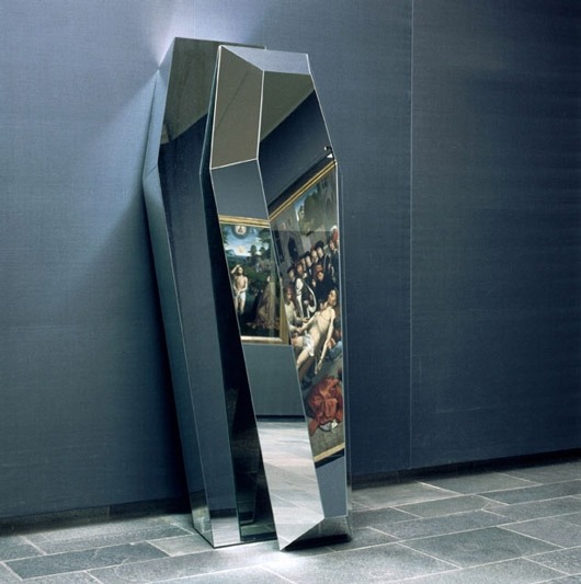
3D-Printed Classical Paintings Will Let The Blind “See” Famous Art For The First Time
The Unseen Art project, which is being run by Helsinki-based designer Marc Dillon, is using 3D printing to give blind people the opportunity to experience classical art that many sighted people might take for granted.
“Imagine not knowing what Mona Lisa’s smile looks like, or Van Gogh’s sunflowers. Imagine you heard people talking about them and knew they existed, but could never experience them for yourself. For the millions of people who are blind, that’s a reality,” the project explains in a video. They use 3D imaging and sand-based 3D printing to recreate these works of art on a scale and quality that can be put on display in museums. (Source)
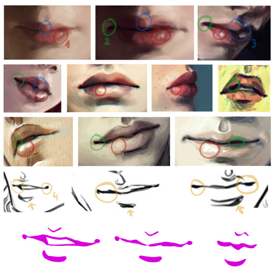
Hello anon! 😀 I’m not the best at making tutorials and giving tips but I’ll do my best to answer your question! ^^
I sure do love drawing lips! It might be in fact my favourite part of the face to draw.
Let’s see what makes them so irresistible 😉
tip 1: let them shine! that tiny shiny spot does wonders for the lips – it makes them fuller, softer and more three dimensional. It also makes the lips look slightly wet. Sexy!
tip 2: Build the depth with some darker spots. Quirking corners are great for that, and if you make the darkest spot in the middle of the mouth it seems like it’s about to part. And maybe whisper something seductive 😉
tip 3: The very middle of upper lip is my favourite area, it gives the mouth its distinct character. It’s also a great spot to play with shadows, one lighter stroke, one darker stroke and you have a very dramatic shading going on!
tip 4: When drawing lineart it’s good to keep the line varying in width and pressure. Equally thin, flat line might look good in anime, but even there it’s rarely the case. Making the line thicker in the shadowy part of the mouth adds depth to your drawing.
General remarks:
I almost never outline the upper lip, it tends to look weird. Just a thin “U” shape in the middle is usually enough.
Upper lip is usually in the shadow, at least half of it. Lower lip tends to catch the light, especially with pouty plump lips. The more shadow you add under it, the fuller the lips look.
When drawing male characters I usually play around with skin tones instead of pink and red (see the third row of examples). But it’s not a rule. Some boys rock them rosy lips. 😉
Never paint the teeth white, never. Gray, yellowish and pinkish tones are great.
And the final tip: use reference! Look for pictures of people with beautiful lips, with thin lips and full lips, try to see which line goes where and how it changes the shape and expression. I hardly ever draw without a reference.
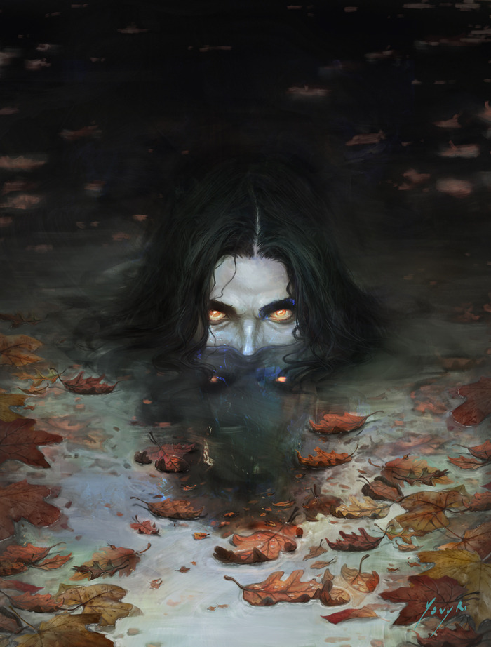
New painting for the Month of Fear challenge “Wicked”.
Not all Nokken are wicked, but the ones that are have been said to have the sweetest songs with words like honey. With kisses and promises, they’ll lure you closer and closer to the water’s edge. By the time you notice you’re out of your depth, it’s too late.
Ysvyri.tumblr.com
Edit: Replaced previous image with the new version of the painting.
This all comes down to why you like fire!
If fire was just that (fire) I feel it’d be quite boring. But the fact its destructive is what makes it personally more interesting to me. It speaks more words imo.
Like after a few years of just looking at matchstick pictures, its sort of an empty picture with no meaning yanoe?
But a picture where something is happening is more interesting to me because it brings feelings, emotions and speaks a thousand words. Most people on fire in pictures tho are usually 1. Using amazing photoshop skills (which deserve recognition imo). 2. Self inflicted in controlled conditions. (I won’t state how to do that here incase anyone tries and messes it up but it is possible to set yourself on fire and still be safe).
Essentially what I’m saying is art comes in all shapes n sizes. and art to me is meant to make you feel something.