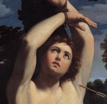
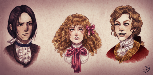
painting of St. Sebastian by Guido Reni used for the cover of Violin.* And I know not every dude-w/-his-hands-tied-above-his-head counts as a St. Sebastian reference but still, it’s interesting to consider whether it might be.
“St Sebastian (feast day January 20th)has become something of a gay icon, as saints go. Partly, perhaps, because it’s an opportunity to depict a curly-haired semi-nude youth in light bondage. It has to be said this isn’t how Sebastian died, or how he was originally depicted. Sebastian miraculously survived being shot with arrows and was healed by Irene of Rome. He continued to denounce the emperor Diocletian, who had him clubbed to death in the year 288.
The tendency to depict Sebastian as a handsome youth pierced with arrows began in the 14th Century when Europe was being ravaged by the plague of the Black Death.
See how the two ‘Sebastians’ in the modern version above look entirely unperturbed by the arrows protruding from their torsos?There is a long tradition of Sebastian looking unaffected by his plight: corruption fails to touch him and that made him proof against plague. Sebastian occupied an important place in medieval religion as a protector against plague. He was seen as a saint whose prayers would work.”[X]
*The lighting on the cover may be distorting the colors and contrast of the original painting, and I’m not even sure that’s the original painting, got that from here [X]… but these changes seem obvious:
changed the trees in the BG,
blended the nips in a little more by changing their color,
rounded his face somewhat (tho, that O could be just making it look rounder)
moved the armpit arrow,
added a tummy arrow,
changed the angle of Left Ribcage Arrow a little bit,
lengthened his hair a little,
reduced the shadows in the Adonis muscle area, too sexy?
That’s a good one for Armand, too! Yeah, he seems preternaturally chill considering he’s riddled with arrows…how does he not feel them??! (I mean yes he’s an illustration but still)
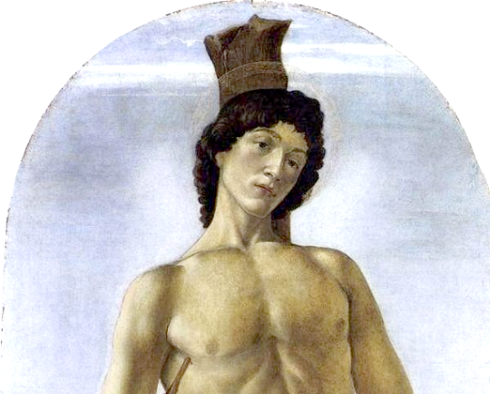
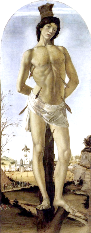
Sandro Botticelli: Saint Sebastian, 1474.
With his martyrdom in progress, the young saint fixes the viewer with a firm, serene gaze. The facial expression, conveying belief in victory over Death, underscores the trust placed at the time in Saint Sebastian that he would protect people from the Bubonic plague.
There are many depictions of this subject, apparently! I really like Reni’s here.
Guido Reni’s Saint Sebastian, “probably one of the most famous, probably because the martyr’s placid expression conveys the idea that he’s already halfway in Heaven. [X] This looks more angelic to me, more like my headcanon of Armand. BTW, who shoots a guy in the armpit?? Gross. RUDE. Gross and rude.
^And I knew that looked familiar, the Reni version was used for the cover of Violin! Which I didn’t read… but I should, right?
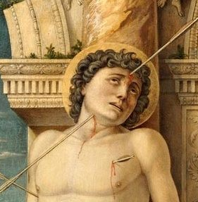
^[X] Similarly, here’s one by Andrea Mantegna. Who shoots a guy in the head like this??? Like, at first I thought it was one arrow going thru his face, but there are two arrows there, a forehead arrow and an under-the-chin arrow, it’s just awkward, gross, and rude.
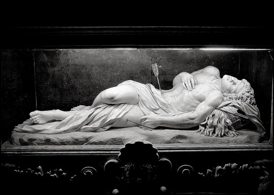
^[X] Sculpture of Saint Sebastian by Antonio Giorgetti (1672). One of my faaaave fanfic writers used this re: their Lestat, and I hope they write more, as they’ve said they are trying to! But anyway, this reminds me of when Lestat was in a coma ;A;
There’s a painting that looks like this and they used it for the cover of Blood & Gold and I know I’m going to have to post about that.
Full shot of Botticelli’s St. Seb under the cut, cut for length.
^He doesn’t look like he’s in any pain at all, really. More like he’s really proud of himself. Very Armand. #CONCEAL DONT FEEL.
Thanks for the info! I think this is pretty cool, that it seems like there is a connection here, but I’m not really hugely into Marius/Armand myself… so ppl who love Armand/Marius more than I do can do their own deep investigating for more, but I did just a teensy bit, this was a cool find:
This is a painting of Da Vinci’s pupil, assistant, and lover Salino Giacomo, or “Salai.” Why is the title “Mona Lisa” an anagram for “Mon Salai” ? Why does a painting of Salai combine with the painting of Mona Lisa?
… “The lover is moved by the beloved object as the senses are by sensual objects; and they unite and become one and the same thing. The work is the first thing born of this union; if the thing loved is base the lover becomes base.” — Leonardo da Vinci
I don’t know the story of Leonardo Davinci /Salai! It’s possible AR was inspired by it, I haven’t seen her mention Salai… Did they do this kind of cute stuff?
Even the physical traits they share are not easily missed. Leonardo da Vince was, actually, blonde. Salai had auburn curls (his actual name was Giangiacomo Caprotti. “Salai” was the name Leonardo gave him. Sounds familiar?)
I watched it on VHS** for the first time, now I have it on DVD, but I don’t have any other formats. The real crime is that I’ve never seen it in a theatre ;A; I was under 17 when it came out!
Lestat has mixed feelings about watching IWTV, bc he enjoys a lot of it, and he loves to tease Louis about the rats and the poodles, it is visually appealing, the kills are pretty accurate and he does love to revisit his seduction of Louis and the times when they were happy <3. But he also feels like the movie overall paints him in an excessively negative light. There are also many scenes that are painful for him (and Louis) to watch, like, y’know, Louis defensively setting Lestat on fire… and when Louis finds Claudia’s ashes. They’ve been through so much ;A;
I would think it would be hard to watch a movie of a time period in my own life, with other people playing me and my family, loved ones, and the people who antagonized me (intentionally or not). To have some enormously famous actor playing me would be flattering but that I’m portrayed as the antagonist in my lover’s life? That would probably hurt. I DO antagonize ppl and ppl antagonize me. We’re all the protagonists in our own stories, and none of us are perfect cinnamon rolls – except Mojo – we’re all works in progress, and I think Lestat watches IWTV with that in mind. He’s grown a lot since then, through a lot of effort and a lot more obstacle-conquering, he’s proven that he has a place in this world, even if he’s mostly serving as a cautionary tale (basically: ”Don’t do this thing that I did!”)
Asterisked stuff and my own movie!IWTV-watching preferences
under the cut, cut for length.
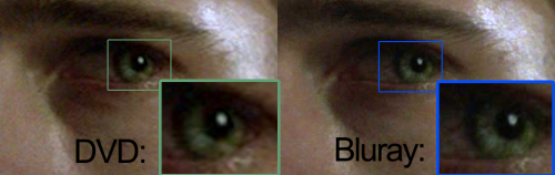
Re: Which do you prefer? I haven’t bought the Blu-ray bc I don’t have a Blu-ray player; I have a small DVD collection but I didn’t want to have to rebuy them all. I agree, the picture quality is in fact better in the Blu-ray,* bc I’ve seen it, so I should probably bite the bullet and get the Blu-ray *pouts* For now, I’m okay w/ missing out on a few of the actor’s eyelashes and skin pores, lol.
I have to listen to music in order to be productive, and I hum or sing along with it. I love listening to the TV or movies when I’m working on my memes or other artistic things, I make jewelry as a hobby, too. But I can’t listen to TV/movies when doing video edits, bc then the audio clashes. Knowing so many of the lines in IWTV, it’s a good one to listen to and say the lines along with it. My voice sounds like a 12 year old’s, I should dub myself in for some of Lestat’s lines and post vids, you’ll think it’s Claudia making fun of him, pfffft.
So yes, I’ll listen to IWTV sometimes for background noise, but when I want to actually watch it on its own or w/ ppl, the DVD is fine, or the Blu-ray, if I’m visiting someone and they have that format at their place.
**There’s something nostalgic for me about the VHS tape format, which I don’t have anymore. It was a big hunk of plastic w/ a thick protective plastic box in my little tween hands when I was 11, and it seemed more substantial, more worthy of carrying a whole tragic & beautiful movie than these fragile little circles in their skinny little cases that we have now. My copy was well-used, and I took good care of it, I never noticed a decrease in the picture quality even after countless replays even tho I’ve heard ppl say that VHS tapes would get worn.
*Re: Picture quality: At first glance, on a laptop or smaller device screen (and at this teensy size like ugh) these two shots of Louis look identical (it’s not exactly the same frame but it’s as close as I could get w/o going crazay):
But when you see it on a bigger screen, there’s more resolution on the
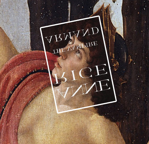
Primavera by Botticelli, painted ca. 1482, vs. the first US cover of The Vampire Armand, published 1998.
WHILE WE’RE ON THIS BOTTICELLI TOPIC. I was thinking about the cover for TVA, and a quick google turned out that was ALSO a Botticelli youth! I don’t know how much input, if any, AR had in this cover design. But it’s a Botticelli so we have to assume whoever pulled the trigger on it knew smtg about AR’s affection for Botticelli, especially as applied to describing Armand.
I tried to put it back into the painting, it had to be flipped twice and rotated a bit…
^IDK about the colors, it does look like the TVA cover made his skin a little rosier, but I’m not sure that Wiki had the right colors for their version. The Wiki article says this person is Mercury.
What does it mean that it was flipped upside down and backwards from its original context? What does the cropping off of the helmet mean? Any other thoughts?
My day was very good, thank u! Hope yours was/is, too.
I looked for the painting and I found 3, there are probably even more than that… thanks for pointing these out to me, I hadn’t seen them before, I can definitely see some Armand in each of them.
In all of them I see the “spun amber” hair thing, as David Talbot being a borderline perv including touching him w/o asking first describes Armand in TVA:
“Your hair’s like something spun from amber, as if the amber would melt and could
be drawn from candle flames in long fine airy threads and let to dry that way to make
all these shining tresses. You’re sweet, boylike and pretty as a girl. I wish I had one
glimpse of you in antique velvet the way you were for him, for Marius. I wish I could
see for one moment how it was when you dressed in stockings and wore a belted
doublet sewn with rubies. Look at you, the frosty child. My love doesn’t even touch
you.”
Apply that description to these:
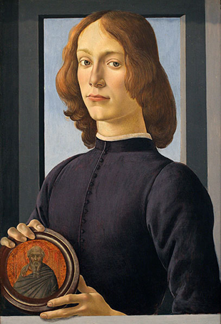
^Portrait of a young man holding a medallion. Altho this one doesn’t resemble Armand to me, it reminded me of his painting the ikons in the caves. “Yeah this took me maybe a half hour… commissions are closed.” Bonus points for the subtle trompe-l’œil effect of his finger sort of out of the frame like that.
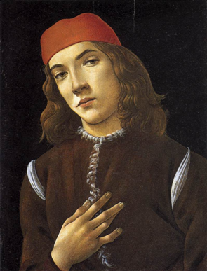
^Portrait of a Young Man 3. This is more physically Armand to me, and of the attitude of Armand, who has perfected the very difficult to achieve front-facing side-eye expression. He’s also throwing a gang sign, is that a W for west coast or an E for east coast? Armand is a riddle, wrapped in a mystery, inside an enigma.
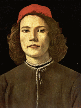
^Portrait of a Young Man. This one has awesome hair, all swirled like that. You might call this portrait boring at first glance but if you give it more of a chance, it has a haunting effect. Is he leaning forward a little? It seems like it. This is more of the coven master face to me than the other two. “If there were a leader… I would be the one.”
(1) First of all, I would encourage you to post your own interpretations, share with us how you see these characters, we have an insatiable hunger for more fanart ;]
If your headcanon is different, that’s great! Variety is the spice of life.
(2) In my experience, having been in VC fandom for 20+ years and on tumblr for about 3.5 yrs, yes, I’ve seen a lot of IWTV-era fanart depicting the male characters with feminine features, you may be right about that. But not all of it is.
[^X Louis, Claudia and Lestat, IWTV-era, by @superhiki, who often uses Daniel Tighe as a reference for Louis, and fandom favorite Danila Kovalev for Lestat (and, not pictured here but worth mentioning, Hiki uses fandom favorite Bjorn Andresen for Armand)]
(3) I get the impression from your message that you consider that “fanart of IWTV makes the boys look like girls” is bad/wrong/incorrect. If that’s not your point, I apologize, and you can skip to (4), but if it is your point, please see this post about fandom policing, here’s an excerpt from @spiderladyceo:
“And no matter how well-meaning you are, you don’t get to tell other fans what they can and cannot write, or draw, or enjoy.
When you start telling people what they can create or enjoy, you invalidate the purpose of fandom, and create a situation where instead of free exploration, we have something similar to mainstream media in which certain tropes or topics are not allowed. This limits the free expression, exploration and innovation so highly prized in fandom.
…You don’t get to tell fans how to enjoy fandom. You mind your own path, your write your own fic, you write meta on why x trope is offensive/problematic/bad but you do not tell other fans how to enjoy fandom.”
(4) I don’t quite understand your distinction between “feminine” and *female* features, except that I consider “female features” specifically to mean female genitalia and secondary sex characteristics (breasts). So I’m only going to address “feminine” features.
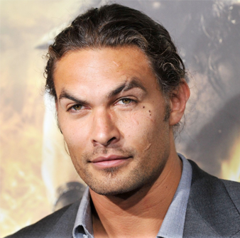
On that point, “smaller jaws, bigger eyes, softer features, bigger lips, small/arched eyebrows” are not exclusive to female characters. Jason Momoa is a man with
BIG EYES, thick lashes, arched brows, big lips, soft jaw, round face,… and I think he is a cis man.
(5) I don’t speak for all the fanartists, but I sent your ask out privately to several fanartists, fic writers, etc., and the general consensus was that if you want to know why a fanartist or writer has made certain artistic choices, you should ask them directly about it and they will answer if they choose to do so.
Some reasons they gave for drawing characters the way they do:
Some fanartists have a different idea of what is “masculine” than you do. It just varies, even in people who express their assigned gender, features differ wildly.
Anne Rice often describes the characters in feminine and androgynous ways.
Many of her vampires were turned young,before developing your idea of “masculine” features, or they never did. Armand was “perhaps seventeen” (TVA) when he was turned and had stopped growing, had not developed masculine features by that time. “My hands are as delicate as those of a young woman, and I was beardless,” (TVA)
It was more fashionable for men during the IWTV-era to be fashionable and cultured, the style of which might be considered a little more feminine by today’s standards. See Dandy.
Their own aesthetic taste may be inspired by anime/manga. One example is Dany&Dany.
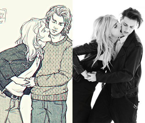
Fanartists often use models and actors as references. Many male models and actors have feminine features. One of them, Andreja Pejić, was a fan favorite as Lestat for many years, and she transitioned MTF in 2013.
[X] this picture of Andreja Pejic (left) and Erika Linder (right).
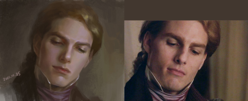
Fanartists may have been inspired by movie!IWTV. Tom Cruise and Brad Pitt already had somewhat feminine features in the early 90′s, which were enhanced in movie!IWTV. This is one of my fave fanarts of Lestat, and it’s based on Tom’s Lestat:
^X Lestat by *HRFleur is so lovely. And someone commented on it that they think he is handsome w/o looking feminine.
“I don’t think he looks like Tom Cruise. I think he looks better! it’s as if you took the essence of Lestat from Tom and pulled the real Lestat out. He looks as though he’s about to say something sarcastic or perhaps become peevish over something. I like that you made him handsome without looking feminine.”
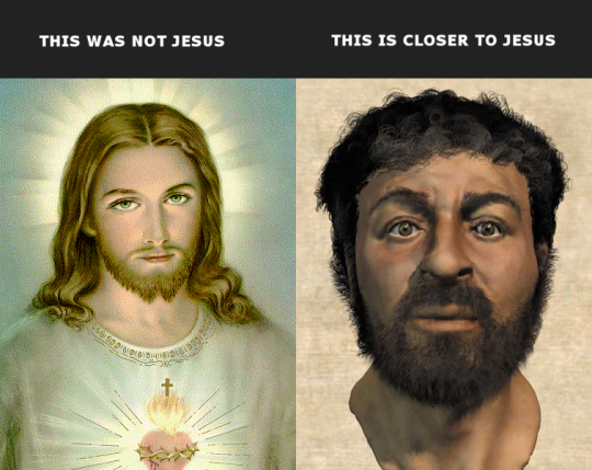
Feminine Jesus Christ:
The idea of drawing men with female or feminine features predates fanart. People depict Jesus Christ with feminine features when there is plenty of controversy about what he actually might have looked like:
^Not my comparison pic, I took it from Janet Carr @ THIS BUG’S LIFE’s post about the Jesus depiction issue. Carr writes that the more feminine Jesus depictions are “actually pictures of Cesare Borgia, son of Rodrigo Borgia, Pope Alexander VI, and brother of Lucrezia Borgia… Pope Alexander VI had all previous depictions of Jesus destroyed in about 1492, and replaced with images of his son. Henceforth, these have been the images used to depict Christ.”
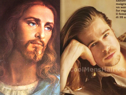
^Here’s our feminized Jesus and early 90′s Brad Pitt, for comparison. I remember Brad being criticized
in the early 90′s
by men for looking too feminine. The pic above is from a magazine, the Italian caption is “Blond, blue eyes, beautiful in spite of himself, and with a smile <<capable of reversing feminism 25 years>>.”
//end. Sorry for the long post, everyone.
I didn’t put any of that under a cut bc I spent a lot of time on this response and I have found that people will reblog, trying to make a post into a discussion, without reading what’s under the cut. People may still want to try to do that, as this is a social network that encourages discussion, but I’m probably not going to engage any further in this topic. I think I’ve made my point, which is that fanartists draw what they want to draw.


